The Complete History & Evolution Of The Aston Martin Logo
Aston Martin, the luxury British carmaker known for its high-performance sports vehicles, has carried a strong identity for over a century. Founded in 1913, the company is as famous for its iconic design as it is for its presence in film and motorsport.
One of its most enduring features is its logo. Although it has evolved over the years, Aston Martin’s emblem has consistently maintained a strong, minimalist design. In this article, we’ll walk through the entire logo history—from 1921 to the most recent update in 2022—and explore the meaning behind its design.
What Does the Aston Martin Logo Mean?
The current Aston Martin logo features a pair of spread wings within a rectangular frame containing the brand name. While many car manufacturers use bold or abstract symbols, Aston Martin keeps it simple.
The wings represent freedom, speed, and elegance—all qualities that define the driving experience of an Aston Martin. The refined shape and layout reinforce the brand’s image of luxury and performance.
Aston Martin Logo Evolution Timeline
Aston Martin has long been a cultural icon, particularly renowned as the preferred car of James Bond. Yet the company has stayed loyal to a clean, graceful look. Let’s trace the logo’s journey from its early designs to the present day.
1921 – The Original Mark
The first logo was basic: just the letters “A” and “M” inside a gold circle. This style matched many logos of the 1920s—classic and understated.
1927 – First Use of Wings
In 1927, the emblem got its wings. The brand name stretched across them, with the central “M” joining the “T”s in “Aston” and “Martin.” The bronze tones made the logo feel both mechanical and majestic.
1930 – Wing Redesign
A slight update followed in 1930. The wings were reshaped into sharper, more triangular angles, and the colour shifted from bronze to silver.
1932 – Sleek and Straight
The wings took on a cleaner, more structured form in 1932. The name appeared inside a small black rectangle, placed at the centre of a gold-framed emblem. It looked refined and ahead of its time.
1939 – Silver Takes Centre Stage
In 1939, the company dropped the gold. The updated logo used silver, giving it a cooler, more futuristic edge. Minor design tweaks refined the overall appearance.
1950 – David Brown Era
With new owner David Brown, the brand added his name above “Aston Martin” in the logo. It featured a 3D wing style that resembled a car grille. The colours returned to silver and black.
In 1971, this logo got a gold makeover for a more luxurious effect.
1972 – Ownership and Palette Shift
Company Developments Limited took control in 1972. The logo lost David Brown’s name, and a new colour scheme was introduced: soft grey wings with gold outlines.
1984 – Classic Modern Design
In 1984, a new logo set the stage for future versions. The wings were redrawn with cleaner detail. The silver, grey, and black palette returned. The text in the rectangular centre was narrower and more precise.
2003 – Cleaner Refinement
The 2003 update closely followed the 1984 version but brought subtle changes. The wings had a black outline. The background became a deep greenish-grey. “Aston Martin” was written in white, sharp and clear inside the rectangle. This version was elegant, minimal, and long-lasting.
2022 – Flat and Digital-Ready Design
In 2022, Aston Martin introduced its latest logo revision. Created with the help of renowned British designer Peter Saville, the update brought these changes:
- Wings simplified: Fewer lines and flatter shapes for a cleaner look.
- No 3D effects: Shadows and depth were removed for a flat, modern appearance.
- Bolder text: The brand name became thicker and easier to read.
- Optimised for digital use: The new logo works better on screens and mobile devices.
Though modernised, it still honours the past. The wings remain central, and the style stays true to Aston Martin’s luxury image.
Aston Martin’s logo has gone through changes—from simple gold circles to stylised wings. But its core message has stayed the same: performance, elegance, and British craftsmanship. The latest 2022 update brings the logo into the digital age without losing the identity it has built over 100 years. As of 2025, the Aston Martin emblem remains one of the most refined and iconic designs in the automotive world.
Find the best Aston Martin cars for sale in the UAE.
Stay tuned to UAE’s most popular auto blog for more information about the latest happenings in all of the Emirates.
Also Read:
- Aston Martin DBX S Unveiled
- 2025 Aston Martin Vanquish Launched In The UAE
- Aston Martin Rapide AMR Review
Follow us on

Recent Stories
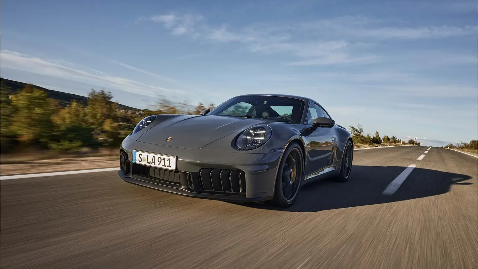
Is The Porsche 911 The Best Sports Car In History?
The Porsche 911 is one of the strongest answers to the question: What is the best sports car in history?...

Top Indoor Activities For Petrolheads In The UAE This Summer
Summer in the UAE pushes many car fans indoors. Desert drives, outdoor meets and long road trips are still popular,...

Top Roadtrip Destinations This Eid Break: Best Getaways in the UAE and Oman
With Eid just around the corner, many of us are looking for a quick getaway to enjoy the break with...

Most Influential Women In The Auto Industry—A Tribute On International Women’s Day
The automotive industry has often been viewed as a male-dominated field. However, women have played a crucial role in shaping...

10 Most Influential Women in Motorsports: International Women’s Day Special
The world of motorsports, once a male-dominated domain, is experiencing a thrilling shift. Talented women are leaving their mark on...

Best Christmas Gifts for Car Guys: Ultimate Guide for Petrolheads
Car enthusiasts are passionate and detail-driven. Choosing the right Christmas gift can feel difficult, especially if you are not into...